Thursday, May 31, 2012

Jade Jagger's home in Goa, India

I must say I'm just a liiiiitle bit stressed out today as I'm gearing up for a business trip to Asia (with my day job). So I'll be whirling around 4 countries in 7 days. Wooooah! In theory it sounds V exciting! In practise not so. But it's got me in the Asian mood all the same and so I thought I'd share this very exotic home of jewellery designer Jade Jagger in Goa, India, photographed by the talented Idha Lindhag. Oh how I wish I was holidaying here......!


Photographer: Jade Jagger stylist Emma Aspelin
I love the flashes of hot pink, it works so well in warm, sunny climes. I'm sure I could feel preeetty relaxed here. Oh won't you invite me to visit Jade?!

And of course I won't leave you high and dry for home inspiration next week as I will in fact report from Asia! So pop by and see me on Monday!

Have a LOVELY weekend!

Wednesday, May 30, 2012

White and colour pops in Malmö's boho district

As I said in Tuesday's post, sometimes you don't need to look further than some of the Swedish estate agent websites for some fabulous interior design inspiration. This white apartment is for sale through Malmö agent Bo-laget and is in the bohemian / arty district of Möllevång. I love how the owners have used white on the walls and floors as a blank canvas and brought the home to life through colourful wallpapers and textiles. 


Bo-laget
I love completely white but I know it's not to everyone's taste - the jury's always out on this! In Sweden it's super popular at the moment and it's the perfect way to create a light home. When I lived in Edinburgh as a student it was popular for every room to be painted a different colour such as deep blue, dark red and yellow. I loved that look too and it suited the environment.

What about where you live?

My home: sitting room

On monday I showed a few snaps of my dining area. Here's the other side of our open plan living space. Looking at the snaps now I see that perhaps it could have been a little neater, but that is our style: laid back! We had great fun creating the picture wall. It was a case of finding items we love and that have meaning such as my daughter's hand prints, a framed heart engagement present from my mother-in-law, a Therese Sennerholt print from my husband, a poem read out on our wedding day which I wrote out and framed, mirrors and sculptures and then a few hours of 'left a bit, right a bit....!'

My Scandinavian Home
I picked up the armchairs for 10 pounds each at a mid century flea market in Malmö - such a bargain!! Admittedly they're a bit 'springy' to sit on but I love the shape of the arms! The shelves are by string. And the mid century coffee table used to be my parents-in-laws but you can pick these up at auction site Lauritz and the lights in the corner are from Granit. The blanket draped over the sofa is from Himla.

In the bottom left of the two top pictures you can just see a little IKEA Lätt childrens table and chair. I painted the top of it with blackboard paint and the legs and chairs white for my girls. The wicker Alseda pouffs are also from IKEA and great for adding a little extra seating when needed.

Next steps - paint the stairs white. Watch this space!!!

Tuesday, May 29, 2012

A beautiful Stockholm apartment with mid-century touches

Sometimes, when you're in need of a little interior design inspiration the best place to turn is the estate agents. Especially Swedish ones like Fantastic Frank. And that's where this beautiful home in Vasastan, Stockholm is for sale. It is oh so Scandinavian, with the beautiful light wood floors, white and pale grey hues and the stark contrast of the wooden mid-century furniture. Such a perfect balance.


Photography:Styling: Sofie GanevaPhoto: Kristofer Johnsson Styling: Sofia Ganeva for Fantastic Frank via Emma's Design Blog
Ooooo what a wonderful home, I don't know how they can bear to part with it. And such beautiful light! What d'you think?

Thank you all so much for your lovely comments about my home dining space yesterday. Tomorrow I thought I'd show a few more snaps from another part of our open plan living space, so pop back if you get the chance!

Hej då!

Monday, May 28, 2012

My Outfit 28052012 - Marine stripes


In my opinion marine stripes are never in, nor out, they are just a classic must have for every women's wardrobe. I recently bought this marine striped T in Zara, like the open back...

Shorts, T: Zara / Sandals, Neon Bandeau: New Look

My home: dining areas!

Morning! I hope you had a wonderful weekend?! Sometimes, an entire weekend at home is just what you need. It helped that the weather was hot hot HOT here in Sweden!.. And I finally got around to putting up my vintage industrial lamp, a birthday present from my parents. Sooo pleased! Here are a few snaps from my kitchen / dining area complete with my little three year old who was busy making me a Mother's Day card, awwww.....

My Scandinavian Home
A little guide: The white storage units are Swedish brand Marbodal. The vintage industrial lamp was sourced online. The Andy Warhol poster is from malmö moderna museet. It's actually a placeholder for now as I'm looking for a great 70's print with a touch of colour. The chair my little three year old is sitting on is trip trap. You may have seen my mid century drinks trolley before here! All my purple / pink cushions are from my favourite, Designers Guild. The floor was originally dark oak which we sanded down and white-washed to brighten up the room.

I have soooo many projects left for this room, my next step is to source an eclectic mix of vintage dining chairs. Watch this space!!

A belated Happy Mother's day to all you beautiful Swedish Mummy's out there! Niki x

Sunday, May 27, 2012

15 Random Beauty Tips and Tricks

1.  A great way to heal dry hands is by rubbing the pith of a lemon all over them.  It works like magic!  (By the way, the pith is the white part between the rind and the pulp.)

2.  Conditioner can also be used as a moisturizer for your body.  When you are in the shower, rub conditioner all over, let it sit for about a minute and then rinse it off. This will actually work better than moisturizer plus it will save money!

3.  When using skin-care and makeup products, never use more than a pea-sized amount.  You will usually never need more than this and it will prevent you from wasting the product.

4.  It is best to use shampoo on soaking wet hair and conditioner on wringed-out hair.

5.  If your wearing a v-neck shirt, apply a little bit of shimmer around the v to highlight your collar bones.

6.  Highlighting your cheeks with a creamy, glowing blush will make your smile stand out and shine!

7.  If you put conditioner on before shampoo, it will make your hair extra shiny!

8.  A little dab of vaseline can be used to remove stubborn eye makeup.

9.  When applying moisturizer or cleaning your face, don't just dab the products on your skin.  Actually massage them into your skin with gentle circular motions.  This will help it to get deep into your pores and will also get the blood flowing to your face.  

10.  To make your hair smell beautiful, run a dryer sheet over it!

11.  To distract people from imperfections on your skin, wear a warm pink lipstick.  This will draw attention to your lips instead of to the blemishes.  

12.  To give a new look to your pony-tail, take a stray strand of hair and wrap it around the elastic.

13.  Turn your lipstick into lipgloss by adding a little dab of vaseline to your lips after applying your lipstick.

14.  If you like to wear perfume, go for an unscented deodorant so the two smells don't clash.

15.  A little dab of honey will help to dry up pimples.  

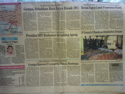
Enam Tahun Gempa Yogyakarta

Enam tahun sudah gempa bumi mengguncang daerah Bantul, Yogyakarta. Gempa berkekuatan 5,8 skala richter tersebut merengut kurang lebih 5000 jiwa termasuk Istiyani Budiningsih, ibuku. Kini enam tahun telah berlalu, tetap semangat kotaku, Bantul Bangkit, Jogja Bangkit, bersama menatap hari esok yang lebih cerah.

Gempa Yogyakarta


Gempa Yogyakarta

Friday, May 25, 2012

It's the weeeeeekend!


Sorry, but I'll have to credit Pinterest for this one. But if anyone can help source this i'd be grateful!
Have a completely great few days and see you monday! N x

Thursday, May 24, 2012

Old meets new in a home with a twist

Inspired by an absolutely beautiful Alice in Wonderland children's garden party I saw here I thought I'd feature a slightly different home today. A beautiful home created by Gilles Jauffret with an eclectic mix of old and new and little unexpected twists.  Personality and creativity sings from every room. A perfect home tour for the weekend!


I


Images from maison Francaise F/M 2012/ Photography; Eric D'Herouville via Haute Design
Any favourite rooms or ideas? Personally, the moss wall stands out a mile, who would have thought it could look so great? People, we need to be more bold!

Just before I head off to the beach with my girls I've got to give you a quick tip to check out the Haute Design blog, it's full of so many fantastic posts, a quick word of warning though, you could be stuck there for hours!

Have a lovely Friday! x


Harbour Cottage, Maine

I have a dream home. It's a cottage over looking a remote, wild coast with the beach on our door step. The winters are wild and romantic with blustery walks on the dunes followed by cosy knits in front of a fire and the summers are spent with morning dips, crabbing and paddling in rock pools with my girls. Balmy evenings with bonfires on the beach and ever changing views. OK I'm getting carried away.But you get the picture! If you don't, this beautiful former General Store in Maine owned by Fiona And Tony Hooper, now renovated into a holiday home may help set the scene. According to Meghan at Wishful Thinking the tide comes up so high it laps at the front door. And behind that door is everything a cottage should be. And it's up for rent...YAAAAAAY! 


Renovated by Architect: Sheila Narusawa Photography / source: Design Skool via Wishful Thinking

If I had a cottage I would definitely go for this beautiful white, pale grey and and light wood scheme. I love that it's kept very basic so that the spectacular views over the bay do all the talking.

I also really love the geometric mustard yellow and white blanket. I wonder where it's from? It reminds me a little of the blankets and textiles from Ferm Living.

Can someone tell me, what's Maine like? I think it could be worth a visit....x

PS Thank you so much to Justine Hand for allowing me to use her lovely photos. There is a great write up on her blog about this home and some of the work Sheila Narusawa put into the renovation.